DIY Wedding Announcements Tips
Now that we’ve discussed boutonnieres and bridal bouquets, I figured it was time to move on to another wedding topic — invitations!
When we were getting married, I searched high and low for the best prices for invitations (for the best quality.) Luckily, I lived in Provo, which is pretty much marriage capitol of the world, so we had a lot of options. We ended up going with Elegant Wedding Announcements, and were super pleased with the results, especially because our designer did everything that we wanted and in a very short period of time. They were exactly what I wanted, and we spent less than $300 on 500 invitations, which, at least back then, was a killer deal.

Back then, I knew nothing about design. There was no such thing as PicMonkey, and I was a stranger to Microsoft Publisher and Adobe PhotoShop. The thought of making my own wedding announcements didn’t even cross my mind. However, things have changed in the past two-and-a-half years, and although I am definitely no graphic designer, I think I could create a wedding announcement very similar to the one we had made. And guess what — it’s not hard at all. All you need is a PicMonkey account, a little creativity and inspiration, and a little bit of time, and you can create an awesome invitation as well. PicMonkey can be free, but I recommend paying the modest yearly fee for it, so you can access all their awesome features.
Before I get into tips on making invitations in PicMonkey, let’s talk about printing first. Obviously, printing is still a bit pricey, but you can find great deals. Here are a few places to check (and for the online places, always, always check and see if there is a coupon available!)
- Companyfolders.com – This company specializes in wedding invitation presentation folders and envelopes. They also offer a Lifetime Warranty to ensure you are satisfied.
- CatPrint.com: After searching around the Internet, this is, by far, the most highly recommended website. Apparently it is inexpensive and they have a lot of different printing options.
- VistaPrint.com: I can personally vouch for the quality of Vista Prints. I have used them several times in the past, and have never been disappointed. There is always coupons available (and if you are on their mailing list, you’ll get them all the time) and often you can add in freebies, such as smaller cards, which would be great for RSVPs. They are super fast, and I think the quality is great. I used the slowest shipping for something awhile back, and it still came in less than a week.
- 123print.com
- overnightprints.com: This site also came highly recommended for doing high quality work for very, very cheap (and fast!)
- Kinkos Fedex
- Costco: Costco does a great job with with everything I’ve printed there, and if for some reason, the prints don’t turn out how you wanted, they will more than likely exchange them for free! I recently had some baby shower invitations printed there, and even though the error was completely my fault, they still exchanged them, no questions asked.
- Local Print Shops: Don’t be afraid to check out local shops. Quite often,they offer very competitive rates and do a good job.
A few other tips on printing – When printing your own, make sure it’s on high quality paper, and I’d avoid using glossy print — definitely use something like matte. It just looks nicer, in my opinion. Also, if you can fit more than one invitation on a page, this can cut costs significantly as well. Just use a good quality paper cutter to cut them apart when they are done!
Alright, now time for creating your own invitation in PicMonkey! If you haven’t seen my ravings about PicMonkey before, just know, that it is my favorite photo editing site ever. I use it for everything! I even have Photoshop Elements, but I find that PicMonkey is way more user-friendly. There are so many great options, overlays, colors, and fonts (you can even use your own), that make it easy to customize anything I am making. Below, you’ll see several different mock invitations I made tonight using PicMonkey. I’ll go over some of the specific details, and hopefully help you figure out how to make your own design.
And before I forget, always save these invitations as .PNG. It will become all blurry if you save it as a .JPG.
First, before you start designing, find examples of designs you like online! I found it much easier trying to replicate other designs I found, rather than just starting from scratch. This way, you can know exactly what overlays, fonts, borders, etc. that you want to use. (Note, some features on PicMonkey are not available in the free version.)
Next, upload a photo to PicMonkey. Any picture will do! Don’t change the dimensions, as they are perfect for printing. After uploading the picture, navigate to overlays, and under geometric shapes, select a square. Drag it over to your picture, and make it big enough to cover the photo in entirety. Then, select the color you want the background of your invitation to be.
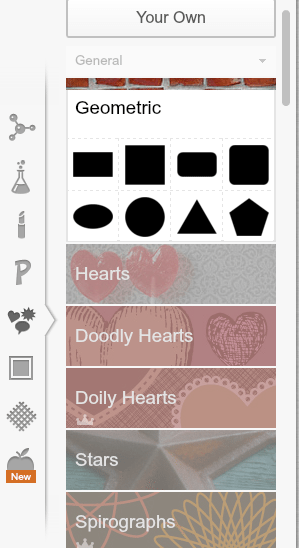
Then, go to the top of the page and press the merge button (in between the arrows and wrench.) This will make your background permanent, and you don’t have to worry about it moving around when you are adding other elements.
![]()
From here, you can just add any elements you want. PicMonkey has a lot of great options — for several of the invitations that I made, I used the frames section to put a nice border around the edge. I also love all the font options — I recommend choosing no more than two fonts. My personal favorite is scriptina pro (which can be seen in the second invitation below) and is actually what we used on our wedding invitations. You can change colors easily, the size of the font, and placement. Something I like to do is write out my message in one generic font, and then highlight the words I want to change to a different font, and then click on that font in the menu. That way, you don’t have to keep going back and forth, adding in new text boxes every time you change the font.
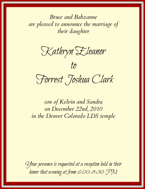
For this first invitation, I simply used a cream background, and then added two frames — first, I selected the simple edge frame, and chose the color I wanted for the outer color and increased the thickness a little bit. Then, for the inner color, I made the thickness zero. I then added the simple edge frame again. I left the inner and outer thickness the same, but I changed the outer color to the same from the first frame, and then left the inner color to white. I don’t remember what fonts I used, but they are easy to find!
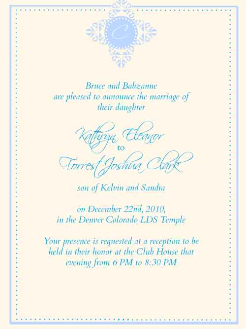
This invitation was a little more complicated. I used a light pink color for the background. Then, I went to overlays, scrolled down the floral, and selected the overlay I used at the top of this invitation. I then scrolled back up to the geometric shapes, selected a circle, resized it, and put it into the middle of the floral overlay. Then, I went down to the label’s overlay section and selected the dotted circle, which I put inside the solid circle. I changed the colors to what I wanted them and then put a “C” in the middle, using the Scriptina Pro font.
For the border solid border, I went to the geometric shape overlays and selected a solid rectangle. I made it very thin, and dragged it to the left over the overlay combo I made at the top of the invitation. I made it the length I wanted (in this case, I had it extend from the top of the overlay, to about 1/4 inch away from the edge) and then I right clicked on the line and clicked duplicate. I pulled the duplicated line to the other side, and then duplicated another one and pulled it to the bottom of the invitation and made it the length I wanted. For the sides, I duplicated the line again, and using the rotate shape button (when you have the overlay selected, there is a little circle by it that you can use to rotate it) to make it vertical. I can never get it completely straight, so I right click on it again, and select straighten.
Finally, for the polka dot border, I just created a text box, and using the Didact Gothic font, typed a bunch of periods in a row. Using the same method I used for the solid border, I filled in the areas I wanted with those dots. (and yes, I realize this one isn’t exactly centered. I was making it on very little sleep!)
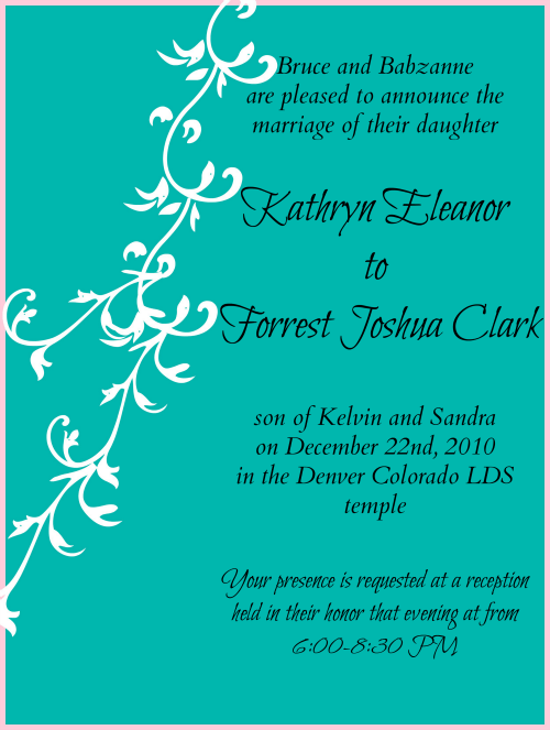
For this next one, I used a simple teal background and a pink border. For the design, I went to the floral overlay section, and alternated using the two overlays in the center of the fourth row. I rotated them as I made them go down the invitation, and changed their color to white.
I don’t know if people outside the Mormon world ever actually put pictures on their invitations (I’m told most people don’t!) but we sure did. These next two are examples of invitations that implement photos. And yes, you get to see a few of our beautiful engagement pictures. You know, back in the day when I actually took more than 10 seconds to do my hair and makeup.
For this first one, I first made it so it was more horizantal than vertical. I did this by going to resize (under basic edits) and just switching the two values in the boxes. Be sure to uncheck keep proportions before you do this.
Then, I used a burgundy background, and added the simple edge frame and changed the colors accordingly. To add in the picture, I selected “Use My Own” overlay, and just selected the photo I wanted. I positioned it where I wanted and then I selected a rectangle overlay. I placed it over the photo and made it completely cover it. Then, I clicked on the rectangle, and selected “send to back.” I then resize the rectangle so the right amount showed behind the picture, and I changed the color of the box.
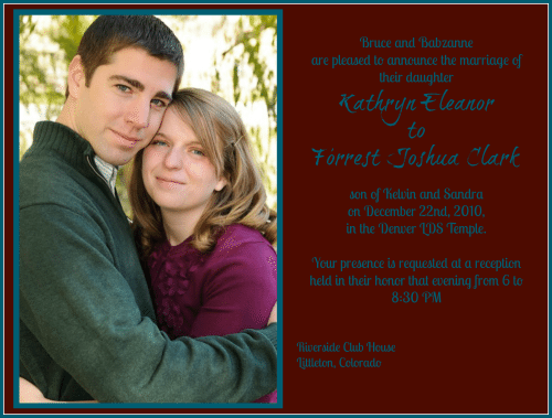
And, finally (if you’ve gotten this far!), here is a full photo invitation. For this, simply upload the photo you want, then add the text wherever you want it. This is definitely the simplest way to go!
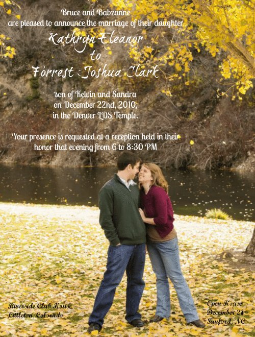
And there you have it. I hope you learned something new, and if you need any help, please, don’t hesitate to ask!




I like your tip about how when printing wedding announcements, you should check out local print shops because they often offer very competitive rates and do a great job. My sister is getting married in 5 months and put me in charge of doing her wedding announcements, and I have no idea where to start. I will definitely keep your great advice in mind when trying to create the perfect wedding announcements for my sister!