Pic Monkey Made Easy: Changing Backgrounds
I don’t know if you’ve jumped on the PicMonkey bandwagon, but I recently did, and I am hooked. Forrest got me Photoshop Elements for Christmas, which I absolutely love. But PicMonkey has a lot of awesome features that are just easier to use than Photoshop, and the results can turn out great.
I actually started using PicMonkey when it was first released, and all the of the features (yes, even the Royale ones) were free! However, when you had to pay for all the cool features, I was disgruntled and decided to “boycott” it. Silly, I know. But I decided enough was enough, and I forked over the money for a membership, and I haven’t looked back. PicMonkey makes it affordable for just about anyone to make their pictures look professional.
It’s taken me a little while to get into the groove of things and figure out how everything works. In fact, I still am! But I’ve found some great ways to enhance pictures, and I want to share some of my tips with all of you. I’ll hopefully do some of these tutorial posts over the next little while, and if there’s something you want to do, let me know. Today is all about the backgrounds.
As you may remember from yesterday’s post about making your own photo backdrop, my background didn’t exactly look professional. And because I’m kind of lazy, I didn’t want to spend an hour making it wrinkle free. I looked around for a tutorial on how to smooth backgrounds in Photoshop, but to be honest, it just confused me. Then I discovered how easy it is to do in PicMonkey.
Here is my wrinkly background in all its glory:
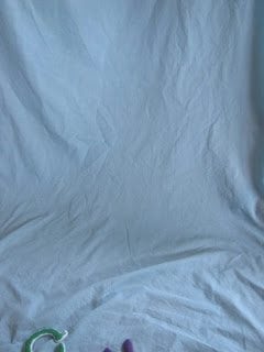
Of course, I first cropped it a little bit, because the toy at the bottom doesn’t really fit in. Then, I simply navigated to the “touch up” category (the little lipstick tube) and selected wrinkle remover. Because I had a fairly large background to work with, and I didn’t have to worry about navigating around any objects, I selected the largest brush size, and I put fade at about 20 percent. Then I just ran the brush over it a few times, and viola, this was the result:
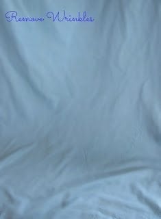
While it still has creases and what not, all over the super noticeable wrinkles are gone. I like to have some creases and bends though, so I think it turned out rather nice. When I showed Forrest, he said, “Well, no need to iron then!”
Next, I wanted to enhance the color just a little bit. The blue was a little dull for my taste. So I scrolled down to highlights, which is also under the touch up category. It has a palette of colors to choose from, so I looked at the blue part, and selected the blue I felt was similar to what I already had. I changed the brush size to the largest one, kept the fade at 20 percent, and brushed over the photo. It looks similar, but the blue shows up just a little better. Before you brush the whole photo, I’d try a few different shades of the color you are looking for, just to make sure it’s exactly what you want.

If you’re like me and don’t want to store tons of different backdrops around your house, PicMonkey makes it very simple to do just that. Still using the highlights feature, I messed around with colors until I found one that I thought looked nice. Super simple. The color does blend with whatever the original background color was, so I’d test the colors first. While that does limit you from changing a color super dramatically — like to complete black, it does make room for some fun color combinations.
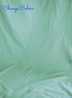
If you want to match colors in your subject to the background, this is also possible through highlights (I really love this feature, as I’m sure you’ll find out in some of my future tutorials!) I just used the eye dropper tool (right above the color palette) to grab the color I wanted to match the background to — in this case, the pink mouth — and after testing the color to make sure I liked it, I changed it to this nice, soft pink.

For these final two steps, I must tell you to proceed with caution. Since I doubt anyone is probably just editing backgrounds like this all the time, these edits will affect the whole photo. So if you are wanting a one step, fix all edit, this might be a great idea. But if you are just wanting to manipulate the background, and not have it affect the subject, I’d be careful. Either way, I do like how these look!
To make the colors super vibrant and playful, we will use cross process. To get to this, go to the “Effects” tab (the beaker with bubbles) and select boost. It will immediately make it a little more vibrant. Then, select the cross process function. It will give you an option of green, blue, or red, and I selected red to get this. Play around with it though to get your desired effect.

Just for fun, here is what happened when I applied this to the photo with the puppy in it. Definitely very bright, but I actually really like how it turned out! Much more fun than what it used to look like, right?

Finally, this feature just makes everything a little more dramatic. This is extremely easy. Just navigate to the dusk option under effects, and it will immediately turn into something like this. The colors are more subdued, and the black vignette makes for a classic picture.
